Background
I created a static website that saves couple pictures, namely Infinite Love, on Valentine’s day 2021. As it is static, adding content requires modifying the source code. To make it more convenient, I decide to create an iOS app. I am quite familiar with web development, however, it is the first time I learn to write an iOS app. In this tutorial, I will introduce how to create an iOS application from scratch.
Note: The tutorial is based on macOS 12.4, XCode 13.4.1, and iOS 15.5.
Set up Environment in XCode
- Open Xcode and either click “Create a new Xcode project” in Xcode’s startup window, or choose File > New > Project.
- In the template selector, select iOS as the platform, select the App template and then click Next.
- Enter the product name, select “SwiftUI” for the interface and “Swift” for the language, and click Next. Choose a location to save the project on your Mac.
For more information, please refer to the official documentation.
User Interface Design with SwiftUI
App Icon and Launch Screen
App Icon
Create the app icon at App Icon Generator and download the archive file containing different sizes of icons.
Open Assets in the left sidebar in the Xcode project and drag Assets.xcassets into the project. They will be automatically assigned.
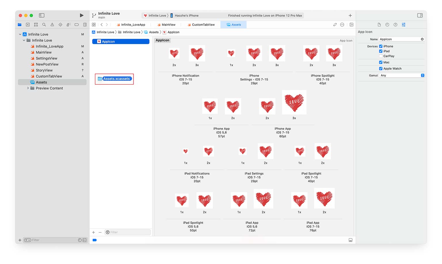
Launch Screen
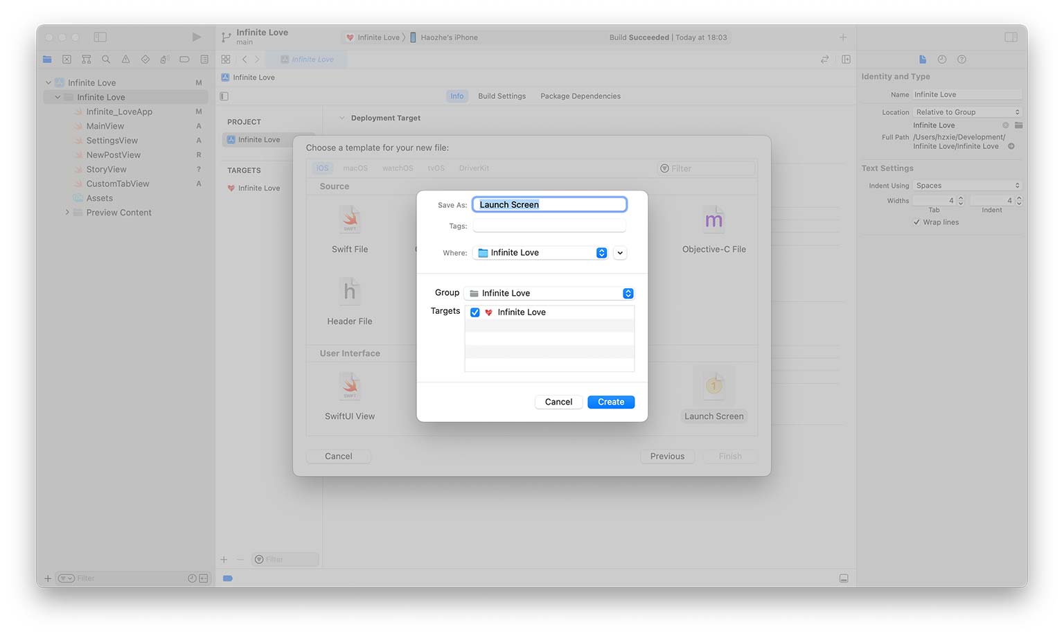
To create the launch screen, add a new file to the project with Launch Screen as its template.
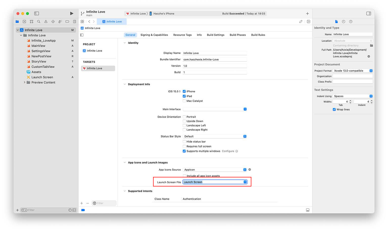
Associate the launch screen file to the created launch screen in the project’s general settings.
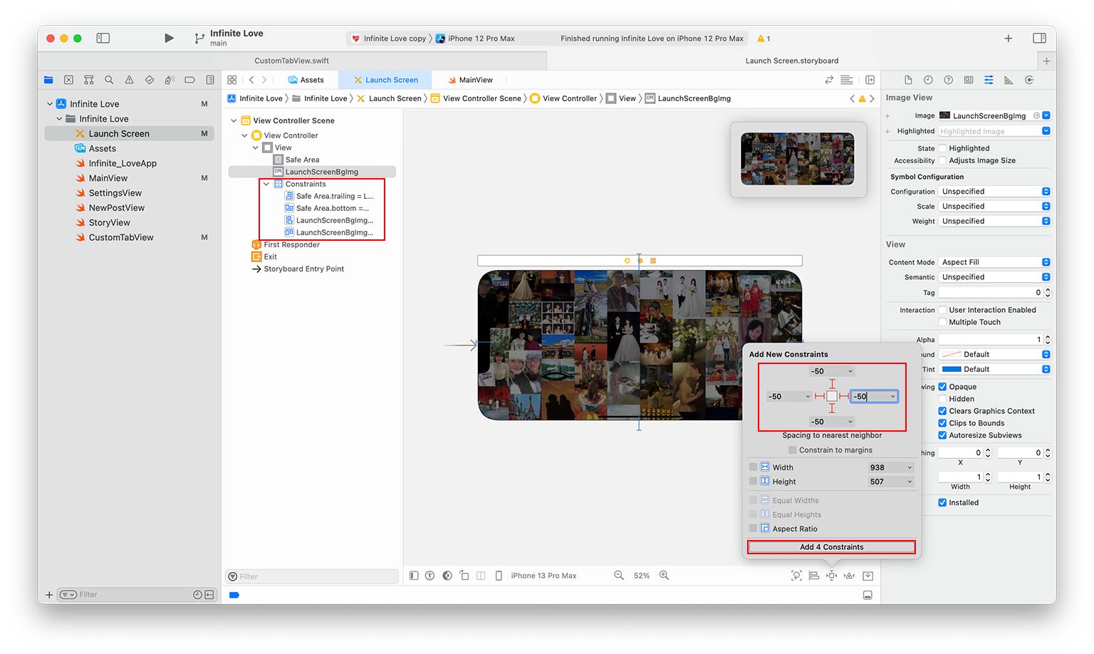
By default, the launch screen contains a Label control with the app name on it. To display an image on the launch screen, we need to add an ImageView control (Press ⌘+⇧+L and darg ImageView to the launch screen view).
The image path can be set on the right sidebar. To make the control full-screened on all devices, we need to add constraints. The top and bottom margins are set to -50 and -40, respectively. The left and right margins are set to 0. Click the button “Add 4 Constraints” and the four constraints will be shown in the left sidebar.
For more information, please refer to the video.
Views and Tab Bars (Bottom Navigation)
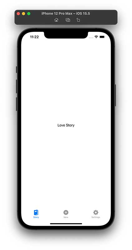
In the iOS app, we create three views, named “StoryView”, “NewPostView”, and “SettingsView”. The implementation is shown below.
struct StoryView: View {
    var body: some View {
        Text("Love Story")
    }
}

struct NewPostView: View {
    var body: some View {
        Text("New Post")
    }
}

struct SettingsView: View {
    var body: some View {
        Text("Settings")
    }
}
To switch between views, we need to create a tab bar at the screen’s bottom. There are two ways to create a tab bar. The one is to use the default one provided by Swift UI, and the other is to create a custom one.
Default Tab Bar
struct MainView: View {
var body: some View {
    TabView {
        StoryView()
            .tabItem {
                Image(systemName: "magazine.fill")
                Text("Story")
            }
        NewPostView()
            .tabItem {
                Image(systemName: "plus.circle.fill")
                Text("New")
            }
        SettingsView()
            .tabItem {
                Image(systemName: "gearshape.fill")
                Text("Settings")
            }
    }
}
}
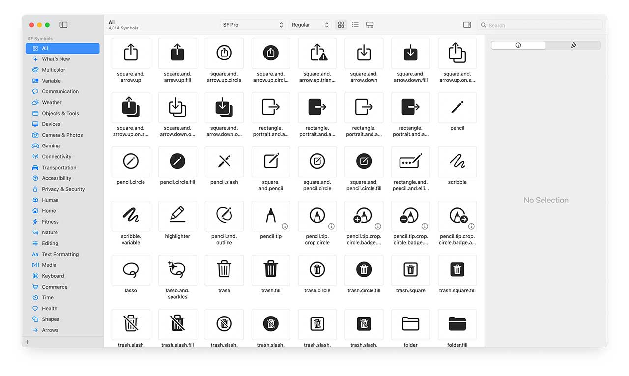
The icon name in the button navigation can be found in the SF Symbols application.
Custom Tab Bar
If we want to add a button in the center of the tab bar, we need to implement a custom tab bar. More explanation can be found in this video.
enum ViewName {
    case Story
    case Settings
    case NewPost
}

struct MainView: View {
    @State private var currentView: ViewName = .Story
    var body: some View {
        VStack {
            switch currentView {
            case .Story:
                NavigationView {
                    StoryView()
                }

            case .NewPost:
                NavigationView {
                    NewPostView()
                }

            case .Settings:
                NavigationView {
                    SettingsView()
                }
            }
            CustomTabView(currentView: $currentView)
        }
    }
}
The CusomTabView takes a parameter that indicates the name of the current view. The full implementation is shown below.
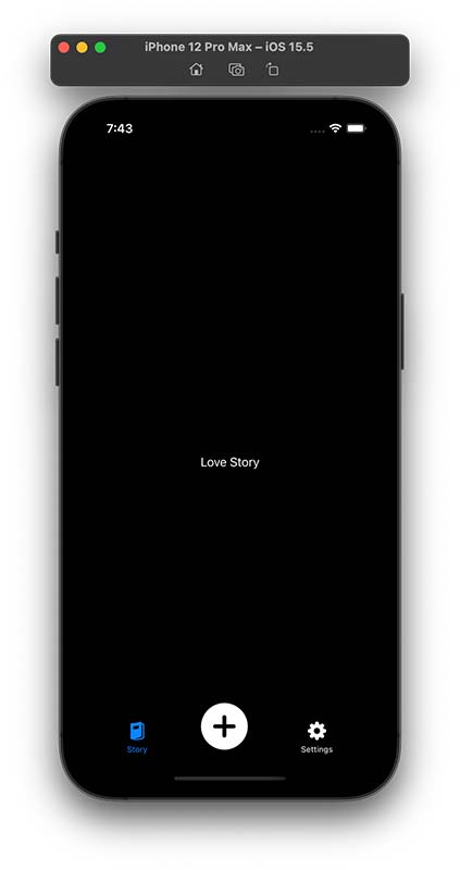
Since the release of iOS 13, Apple allows users to choose between light and dark system-wide appearance. @Environment(.colorScheme) var colorScheme detects which mode is enabled in iOS. As shown in the figure on the right, the app UI already looks great in dark mode even without any modification.
struct CustomTabView: View {
    @Environment(\.colorScheme) var colorScheme
    @Binding var currentView: ViewName
    var body: some View {
        HStack {
            Spacer()

            Button {
                currentView = .Story
            } label: {
                VStack {
                    Image(systemName: "magazine.fill")
                        .resizable()
                        .scaledToFit()
                        .frame(width: 25, height: 25)
                    Text("Story")
                        .font(.caption2)
                }
                .foregroundColor(currentView == .Story ? .blue : .primary)
            }

            Spacer()

            Button {
                currentView = .NewPost
            } label: {
                ZStack {
                    Circle()
                        .foregroundColor(colorScheme == .light ? .white : .black)
                        .frame(width: 25, height: 25)
                        .shadow(radius: 2)
                    Image(systemName: "plus.circle.fill")
                        .resizable()
                        .frame(width: 64, height: 64)
                }
                .foregroundColor(currentView == .NewPost ? .blue : .primary)
                .offset(y: -16)
            }

            Spacer()

            Button {
                currentView = .Settings
            } label: {
                VStack {
                    Image(systemName: "gearshape.fill")
                        .resizable()
                        .scaledToFit()
                        .frame(width: 25, height: 25)
                    Text("Settings")
                        .font(.caption2)
                }
                .foregroundColor(currentView == .Settings ? .blue : .primary)
            }

            Spacer()
        }
    }
}
Custom Image List
To display the image list in StoryView, we define a new class, named Post.
import Combine

class Post: ObservableObject {
    @Published var image: String
    @Published var text: String

    init(image: String, text: String) {
        self.image = image
        self.text = text
    }
}
where ObservableObject can notify other views whenever its property’s value is changed. The @Published annotation is a property wrapper that works along with ObservableObject. When a property is prefixed with @Publisher, this indicates that the publisher should inform all subscribers (i.e. views) whenever the property’s value is changed.
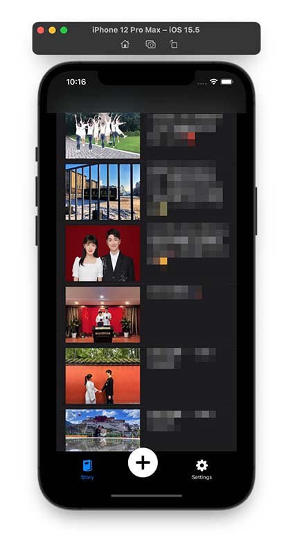
With the defined Post class, the content in StoryView can be generated by passing an array of Post. Here, we also adopt HStack to arrange the image and text horizontally. Note that AsyncImage introduced in iOS 15 allows the app to load images directly from the Internet. The full implementation is shown below.
struct StoryView: View {
    var posts = [
        Post(image: "https://love.haozhexie.com/img0.jpg", text: "Text 1"),
        Post(image: "https://love.haozhexie.com/img1.jpg", text: "Text 2"),
    ]

    var body: some View {
        List {
            ForEach(posts.indices, id: \.self) { idx in
                HStack(alignment: .top, spacing: 20) {
                    AsyncImage(url: URL(string: posts[idx].image)) { image in
                        image.resizable()
                    } placeholder: {
                        ProgressView()
                    }
                    .frame(width: 160, height: 120)

                    Text(posts[idx].text)
                        .font(.system(.body, design: .rounded))
                }
            }
        }
    }
}
Deploy the App on Your iPhone
There are several ways to deploy the app on iPhones
- App Store Distribution
- Ad-Hoc Deployment
- Enterprise Deployment
- Non-market App Distribution (without Apple Developer Subscription)
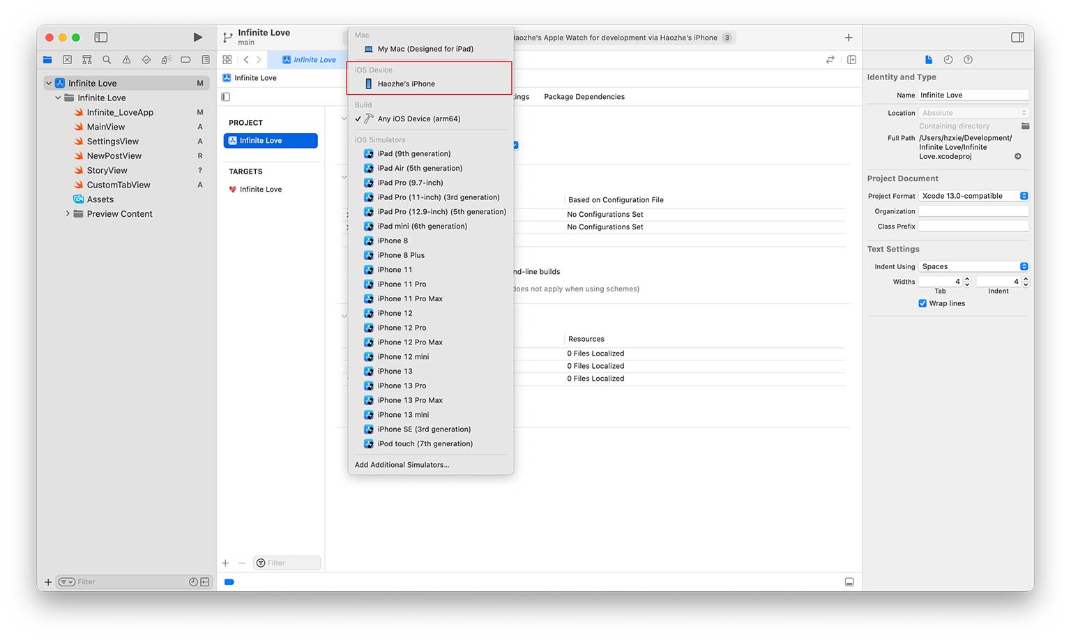
For non-market app distribution, you can simply connect your iPhone to your Mac with cables, and trust the developer certificate on your iPhone. Then select the target device to your iPhone (as the image shown below).
References
- https://www.appcoda.com/learnswift/
- https://developer.apple.com/tutorials/swiftui/interfacing-with-uikit
- https://developer.apple.com/documentation/xcode/specifying-your-apps-launch-screen
- https://iosapptemplates.com/blog/swiftui/tabview-swiftui
- https://www.youtube.com/watch?v=Ey0_kbAeWKg
- https://www.youtube.com/watch?v=v19fln0e_qQ
The Disqus comment system is loading ...
If the message does not appear, please check your Disqus configuration.